Paint Trends: Color That Works With Your Finishes
Explore a sourced 2027 paint palette with practical ways to coordinate countertops, tile and cabinets, test samples and choose the right finish.

AI design concept: a green island creates one focal area within a light kitchen. Approximate colors illustrate placement, not exact paint matches or a completed BALLENCIACE project.
Paint Trends | October 2026 edition
A paint trend becomes useful when it helps you make a decision about your own kitchen or bathroom. Start with the finishes that will remain, decide which surface should carry the color, then test the combination in the room. Choose the coating and sheen after those decisions, with the surface and its use in mind.
For this month's edition, we are applying Benjamin Moore's 2027 Color Trends announcement, published October 14, 2026. The forecast year is 2027; October 2026 is the month of this practical interpretation. A manufacturer's selection offers inspiration, not evidence that a color suits every home or is in demand locally.
Start with what you are keeping
Before collecting paint ideas, list the flooring, countertop, tile, cabinetry and metal finishes that will stay. Bring samples together where possible. If the countertop is already selected, use that decision as a starting point instead of choosing paint in isolation and hoping the two work together.
Our suggested order is simple: retained materials first, approved new materials second, undecided paint last. A cream countertop and a bright-white tile can make the same off-white sample look different beside each. Decide whether you like that relationship in person before committing to a whole room.
Benjamin Moore's bathroom color guidance also identifies countertops, backsplashes, fixtures and flooring as part of color selection. For a remodel, record which finishes are fixed and which are still flexible. That keeps a new paint idea from quietly changing the rest of the scope.
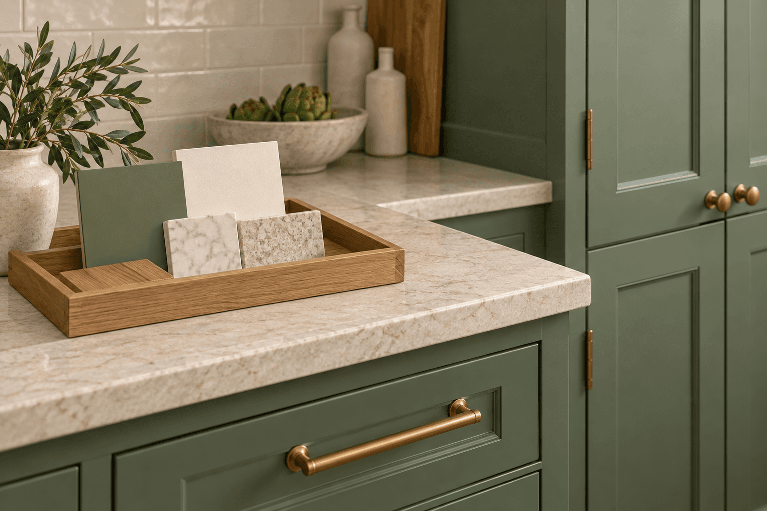
AI design concept: compare paint with the countertop, wood and other finishes that will stay. These illustrative materials and colors are not specified products or exact matches.
Use three sourced colors as a starting point
The manufacturer's 2027 palette includes Webster Green HC-130, White Down OC-131 and Nelson Blue CW-635. The Nelson Blue page also lists these three together as coordinating colors. Our room placements below are examples to test, not a prescription.
Webster Green HC-130: consider it for one focal surface, such as an island or vanity, when you want color to lead the room.
White Down OC-131: test this creamy off-white as a quieter surrounding color, especially beside the actual tile and countertop.
Nelson Blue CW-635: try this pale blue as an alternative for cabinetry or a vanity when the green feels stronger than you want.
You do not need all three in every room. A two-color scheme can leave space for wood grain, patterned tile or a countertop with movement. Keep those materials visible while you compare options.
Choose how much color you want to live with
An island gives you a defined place to introduce a stronger color. Extending it onto perimeter cabinets changes the balance of the entire kitchen. Neither arrangement is automatically better. Compare the amount of painted surface, the contrast with the countertop and the way adjacent rooms appear through open doorways.
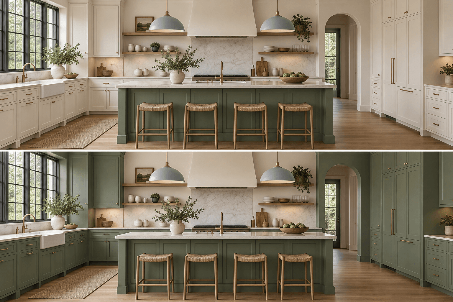
AI comparison: the upper view limits green to the island; the lower view extends it across the perimeter cabinetry. Compare color coverage, not an exact paint formula or predicted lighting result.
For a bathroom, a colored vanity can become the main feature while the surrounding surfaces stay quiet. If the tile already has a busy pattern, try the paint sample next to it before adding another strong element. If you are keeping the vanity, test a wall-color change first and decide whether repainting cabinetry belongs in the project at all.
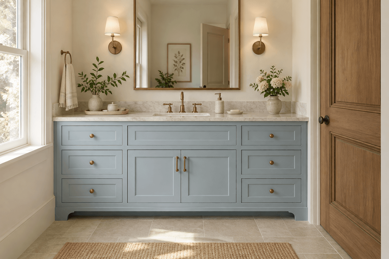
AI design concept: a pale-blue vanity introduces color on one surface. The image shows a palette idea, not an exact paint match, coating specification or completed project.
Make the sample test a decision, not a formality
Use physical samples in the actual room. Benjamin Moore's sampling instructions recommend at least two coats for its liquid samples and suggest movable white foam boards. Check the candidates through the day and under the artificial lighting you normally use. Its sample paint is for evaluating color, not the finished coating.
Put each sample where the paint will go: upright beside a cabinet or tile, near the counter edge and in a shadowed corner. Keep the surrounding materials consistent while comparing candidates. A phone photograph can help you remember the arrangement, but it should not replace the physical comparison.
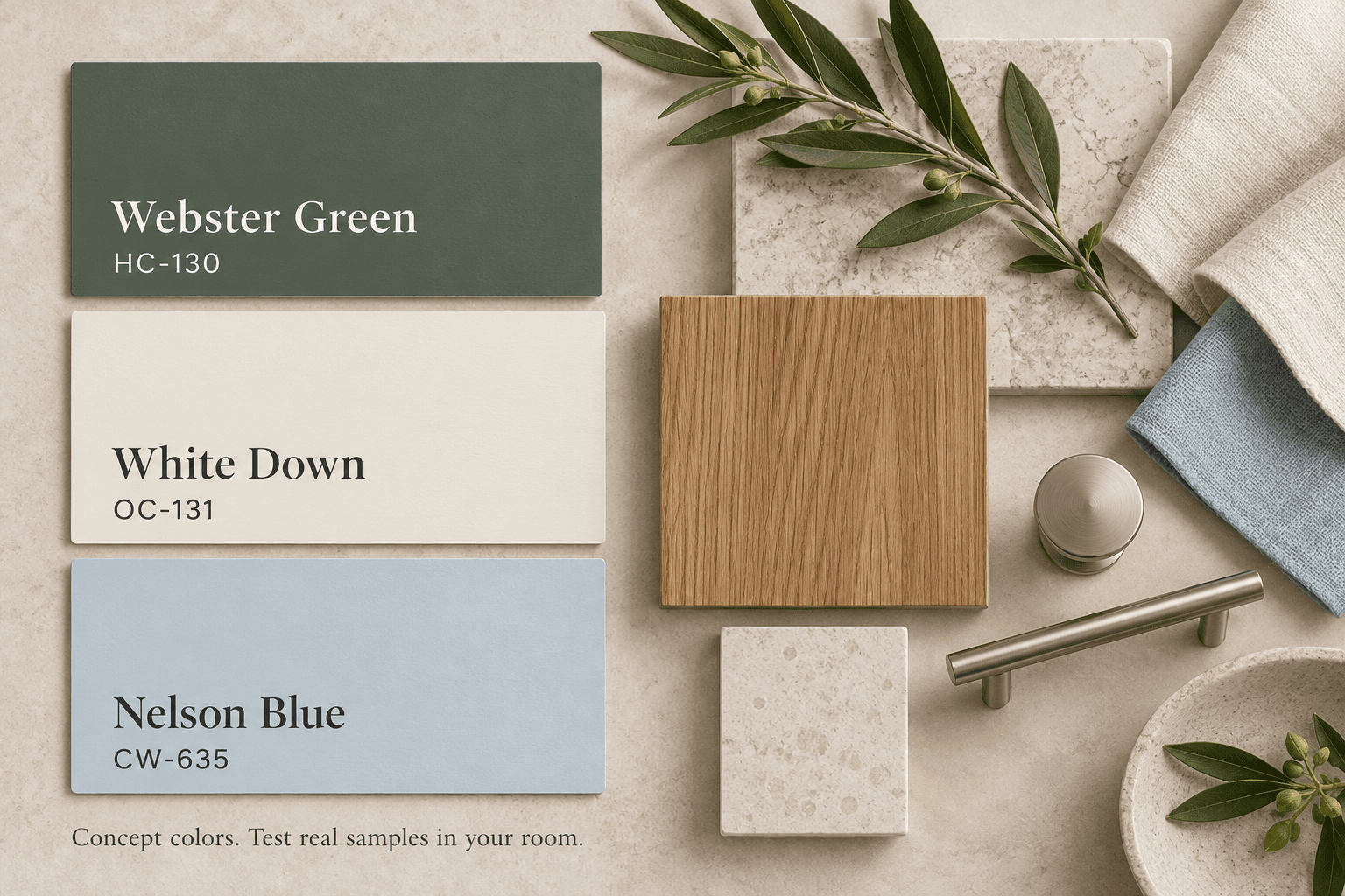
Concept palette: Benjamin Moore Webster Green HC-130, White Down OC-131 and Nelson Blue CW-635. Names and codes are sourced; displayed hues and materials are approximate. Confirm with physical samples.
Separate the color from the coating
A color name does not specify the product, sheen, preparation or application. Benjamin Moore's finish guidance explains that sheen changes reflected light and color appearance; gloss can also make surface imperfections more noticeable. Compare the intended finish as well as the color before final approval.
For cabinets, identify the existing surface and ask what cleaning, preparation, primer and coating system the work requires. For bathroom walls, confirm that the chosen product is specified for the surface and exposure. Keep ventilation and moisture concerns in the remodel discussion; a palette decision does not resolve them. Do not assume a wall paint and a cabinet finish are interchangeable because their color codes match.
Bring a clear selection record to your remodel
Save these decisions with your project notes:
Finishes staying: countertop, flooring, tile, cabinets and hardware.
Paint placement: which walls, doors, trim or cabinets will change.
Candidate: manufacturer, exact color name and code.
Sample result: room, location, lighting and what you liked or rejected.
Final specification: product, sheen, preparation and included surfaces.
For a kitchen remodel or bathroom remodel, bring the record alongside your layout and material priorities. If you are still choosing floors, our tile, LVP and hardwood guide can help define that earlier decision. Talk with BALLENCIACE about coordinating the finishes and painting scope within your design-build remodeling plan.
By BALLENCIACE Construction. Sources checked October 26, 2026. Prepared with AI assistance using the manufacturer sources linked above. Images are educational design concepts, not completed BALLENCIACE projects. Screen colors and generated scenes are approximate; confirm actual samples and product specifications before purchasing.